
Overview
The Overview page serves as the starting point for navigating Tokenomist. It provides a high-level summary of key market emissions and upcoming supply changes. From here, you can quickly identify trends and direct yourself to other features for deeper analysis.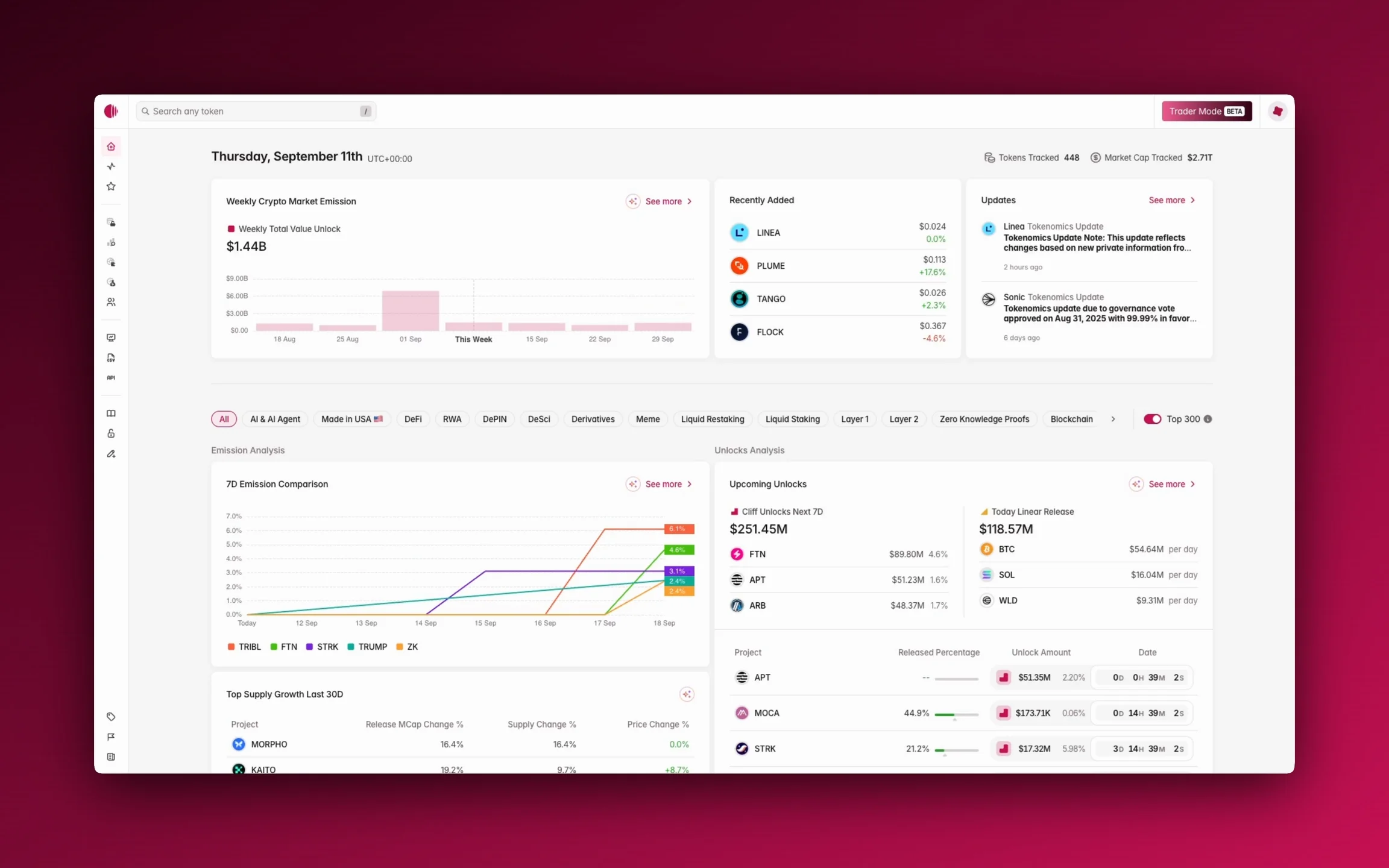
Access
You can access Overview from the sidebar.Features
Top bar
Date
This part shows today’s date, assuming UTC+0.Tokens Tracked and Market Cap Tracked
These parts show how many tokens and market cap that Tokenomist.ai can track.AI Insights
AI Insights presents highlights this week about Trending TGEs, Insider Unlocks, Biggest Cliff Unlocks, and Top Burns & Buybacks.Highlight bar
At the top of the main data sections, you’ll find filters that allow you to customize your view. You can filter by category (e.g., AI & Agent, DeFi, GameFi) or focus on the Top 300 tokens by market capitalization.Weekly crypto market emission
This chart shows the total value of all tokens that have released in the past week, providing a clear picture of new supply. Hovering your mouse over the element will show weekly total emission amount in USD. This section is also a snapshot of Crypto Market Emission.Recently added
A list of tokens recently added to the Tokenomist.ai platform.Updates
A news feed of recent tokenomics changes that keeps you informed when projects adjust their allocations or release schedules. This section is also a snapshot of Updates. Learn more about how to use Crypto Market Emission, our Token Listing Process, or how Updates work.Buyback analysis
Top buyback tokens last 30d
The chart compares token buybacks over the last 30 days using two measures: total buyback value in USD and the percentage of maximum supply repurchased. Hovering your mouse over the element will show buyback value (last 30 days); total buyback (all-time); supply impact as percentage of max supply and circulating supply; recent activity last 24 hours, 7 days, and 30 days; and last buyback. This section is also a snapshot of Buyback Screener.Burn analysis
Top burn tokens last 30d
This chart shows the top token burns over the last 30 days, comparing total burn value in USD with the percentage of max supply burned. Hovering your mouse over the element will show burn value (last 30 days); total burn (all-time); supply impact as percentage of max supply and circulating supply; recent activity last 24 hours, 7 days, and 30 days; and last burn. This section is also a snapshot of Burn Screener.Post-unlocks analysis
On-chain claims
This table details tokens with recent on-chain claims. It shows the total unlocked value and the percentage that has been claimed, providing a more accurate picture of the true circulating supply. Hovering your mouse over the element will show total claimed and total unlocked value in token. This section is also a snapshot of On-Chain Claims.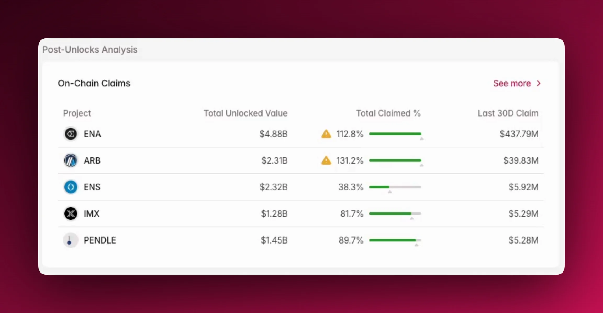
Allocation analysis
Token allocation comparison
A bar chart that visually represents how a token’s supply is allocated among different stakeholder groups. It offers insight into the distribution of a token and potential concentrated selling interest. Hovering your mouse over the element will show group allocation and amount allocated in token and percentage. The section is also a snapshot of Compare Allocation. Learn more about Group Allocations.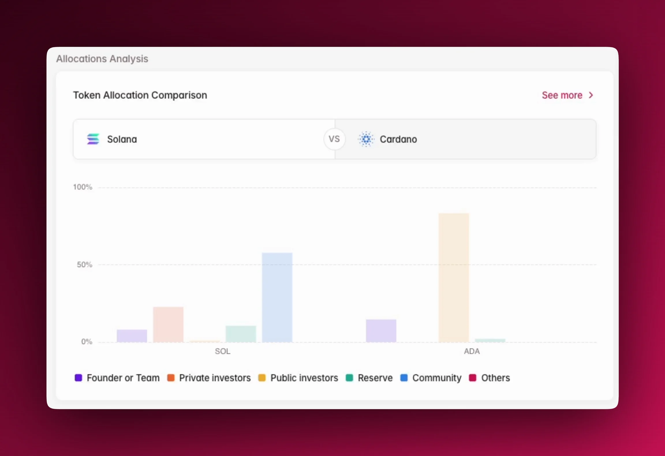
Emission analysis
7D Emission Comparison
The chart in this section illustrates the 7-day emission comparison by highlighting which tokens are adding the most new supply to the market. This is useful for identifying potential sell-side pressure. Hovering your mouse over the element will show emission percentage of circulating supply of each token at different point of time. The section is also a snapshot of Compare Emission.Top Supply Growth Last 30D
This table highlights tokens with the highest supply growth over the last 30 days. It includes key metrics like market cap change, supply change, and price change, which can help you identify tokens with rapidly expanding supply.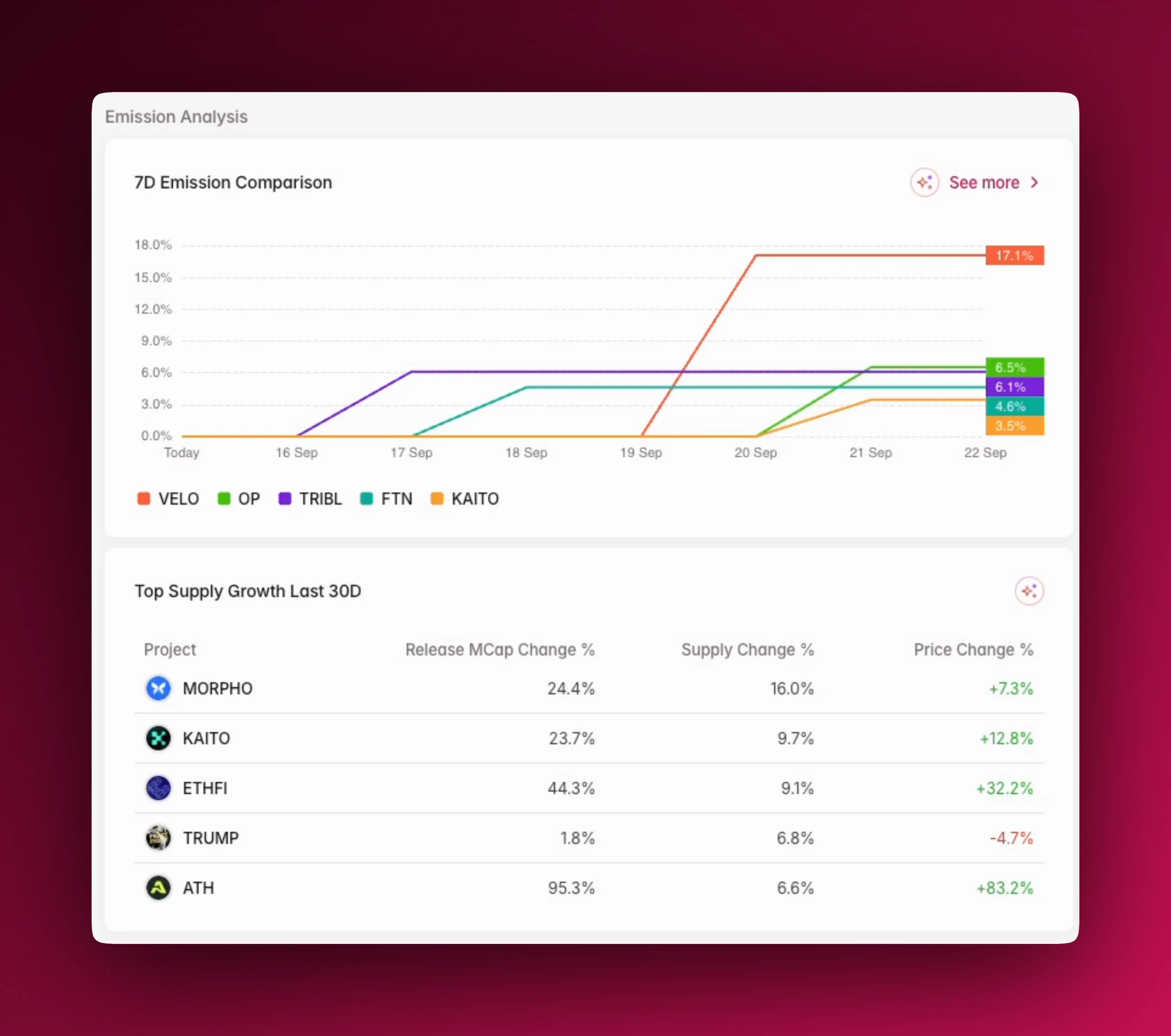
Unlocks analysis
Upcoming unlocks
Cliff Unlocks Next 7D This section highlights any significant cliff unlocks happening soon, which can lead to sudden shifts in market supply. Hovering your mouse over the element will show allocations, unlocked amount in USD and token, and type of unlock. The section is also a snapshot of Token Unlocks. Today Linear Release This section shows the total value of tokens being released in a linear fashion on the current day, which helps you understand constant supply flow. Hovering your mouse over the element will show allocations, unlocked amount in USD and token, and type of unlock. It is also a snapshot of Token Unlocks.Upcoming Unlocks Table
The main table below provides a previewed of upcoming unlocks, including both cliff and linear events. You can use this to see the total unlocked amount for each project and its value. This gives you assess the potential impact on the market. Hovering your mouse over the element will show total unlocked; max supply; supply y2035; allocations; unlocked amount in token, USD, and percentage of released supply.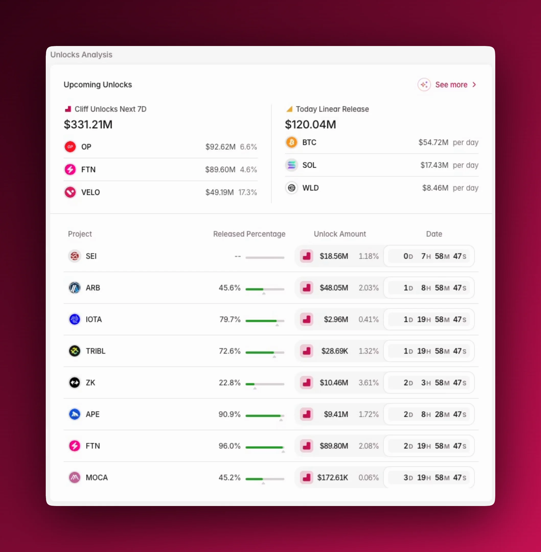
Using Overview
- Filter by: Sectors
FAQs
Where to next
- Explore our trending tokens and unlocks insight at the bottom of the page.
- Learn more about AI Insights.