
Emission Comparison
Overview
Rather than looking at emissions in isolation or the overall state of the market in Crypto market emission, Emission Comparison lets you see multiple tokens side by side, compare their upcoming releases, and visualize how much pressure each project is facing relative to supply. This context is essential — a single token release might look large in absolute terms, but when compared against peers in the same sector, it may be relatively small. Likewise, two projects might both unlock $50m, but if one represents 2% of supply and the other 20%, the impact is very different.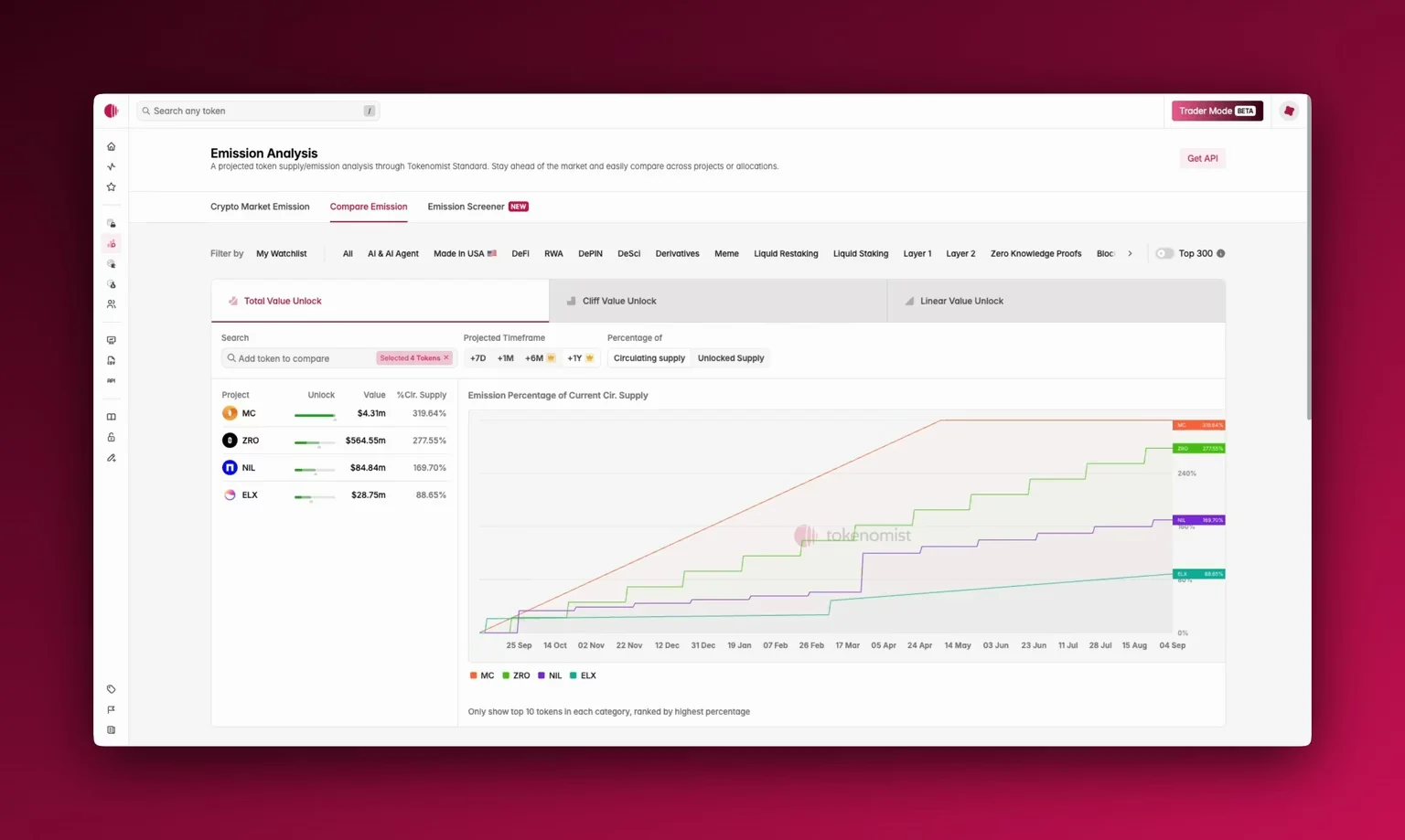
Accessing Emission Comparison
You’ll find Emission Comparison in the top navigation, next to crypto market emission, or through the sidebar. When you open it, you’ll see three panes at the top:- Total Value Unlock shows the combined value of all unlocks, regardless of type.
- Cliff Value Unlock isolates sudden one-time releases (e.g., team or investor cliffs).
- Linear Value Unlock highlights tokens that are gradually released over time.
Using Emission Comparison
Start by choosing your timeframe: one week, one month, or extended horizons of +6 months or even +1 year . You can add any project for side-by-side comparison. By default, the top tokens are ranked by highest emission percentage. You can choose to view emissions as percentages of circulating supply (reported by CoinGecko) or by unlocked supply (the current released supply). Please see Supply Metrics to learn more about how we define various types of supply. Pro users can also export all comparison data as a CSV for deeper analysis.Where To Next?
- Learn how we categorize Cliff and linear releases.
- See how you can utilize Crypto Market Emission and Emission Screener together with Emission Comparison.
- Export data for custom analysis with CSV Download.