> ## Documentation Index
> Fetch the complete documentation index at: https://docs.tokenomist.ai/llms.txt
> Use this file to discover all available pages before exploring further.
# Compare Allocation ♕
> Compare token distribution across projects to see who holds supply
This feature is only available to **Pro** users.
# Overview
**Allocation Comparison** lets you compare how different projects distribute their tokens across key stakeholder groups. [Allocation structures](/group-allocations) reveal who controls a project's supply and where future selling or governance power may come from — a project with a heavy investor allocation looks very different from one dominated by community or ecosystem reserves.
Instead of looking at one project in isolation, you can line up multiple tokens side by side and compare how they have structured their stakeholder allocations, quickly seeing which projects are founder-heavy, investor-heavy, or more community-driven. This feature uses Tokenomist's standard allocations framework, ensuring every project is classified in a consistent way.
 # Accessing Allocation Comparison
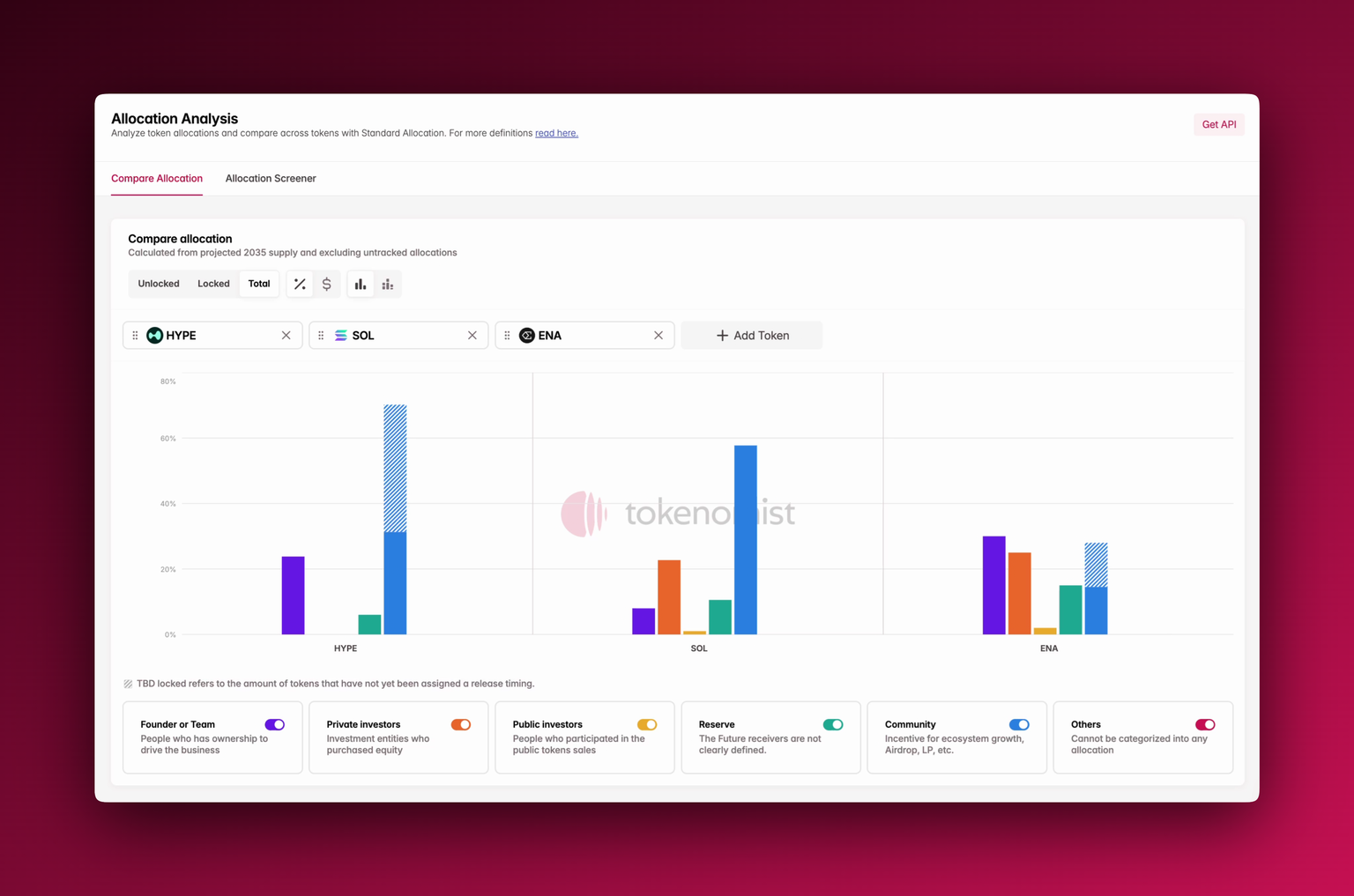
You'll find **Allocation Comparison** under the Allocation tab in the navigation bar, or through the sidebar. When opened, you can add any tokens to the comparison pane. Each project will appear with its supply broken down by allocation category.
# Using Allocation Comparison
At the top, you can toggle between **Unlocked**, **Locked**, or **Total** supply distribution. You can also switch between **percentage view**, **absolute USD value**, or a **stacked bar layout** for easier cross-project comparison.
The chart can also be grouped both **by token** or **by allocation** for easier comparison across categories.
Each bar is color-coded by allocation type, and can be toggled at the bottom of the component. The **striped section** of a bar represents [**TBD allocations**](/tbd-locked)\*\* \*\*: tokens that don't yet have a defined release schedule.
# Where To Next?
* See our methodology for classifying allocations in [group allocations](/group-allocations).
* Check out [supply metrics](/supply-metrics) to learn more about definitions of terms like circulating and unlocked supply.
* See [TBD locked ](/tbd-locked)to learn more about how we tackle unpredictable release events.
* Learn more about how to use [allocation screener](/allocation-screener) in parallel with Allocation Comparison.
# Accessing Allocation Comparison
You'll find **Allocation Comparison** under the Allocation tab in the navigation bar, or through the sidebar. When opened, you can add any tokens to the comparison pane. Each project will appear with its supply broken down by allocation category.
# Using Allocation Comparison
At the top, you can toggle between **Unlocked**, **Locked**, or **Total** supply distribution. You can also switch between **percentage view**, **absolute USD value**, or a **stacked bar layout** for easier cross-project comparison.
The chart can also be grouped both **by token** or **by allocation** for easier comparison across categories.
Each bar is color-coded by allocation type, and can be toggled at the bottom of the component. The **striped section** of a bar represents [**TBD allocations**](/tbd-locked)\*\* \*\*: tokens that don't yet have a defined release schedule.
# Where To Next?
* See our methodology for classifying allocations in [group allocations](/group-allocations).
* Check out [supply metrics](/supply-metrics) to learn more about definitions of terms like circulating and unlocked supply.
* See [TBD locked ](/tbd-locked)to learn more about how we tackle unpredictable release events.
* Learn more about how to use [allocation screener](/allocation-screener) in parallel with Allocation Comparison.